CSS Block Grid
CSS Block Grid by using grid.
.container {
  display: grid;
  grid-template-columns: repeat(auto-fill, minmax(200px, 1fr));
  grid-column-gap: 3px;
  grid-row-gap: 3px;
}
The minimal(200px, 1fr) means every grid column has minimal 200px width. If there are more spaces, they all have equal width because of the 1fr fraction setting. The repeat and auto-fill means repeating the column to fill in as many columns as possible according to the minmax(200px, 1fr) requirement.
Demo
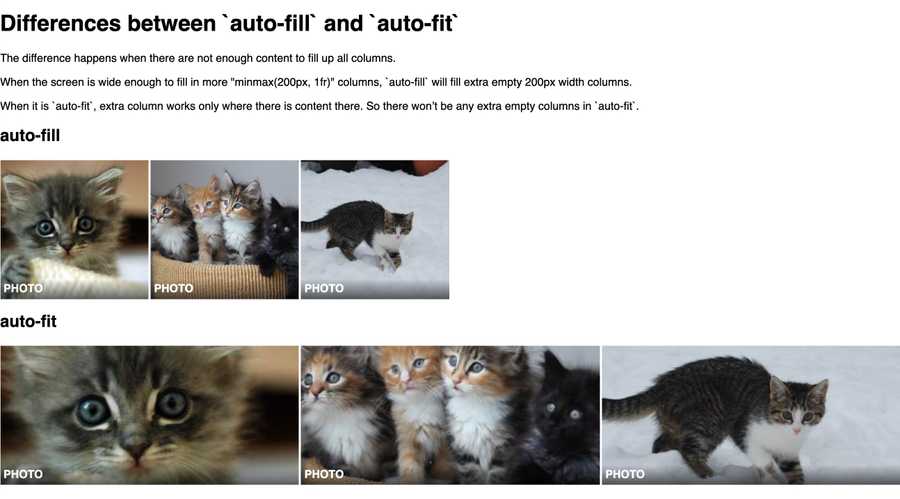
Differences between auto-fill and auto-fit
The difference happens when there are not enough content to fill up all columns.
When the screen is wide enough to fill in more "minmax(200px, 1fr)" columns, auto-fill will fill extra empty 200px width columns.
When it is auto-fit, extra column works only where there is content there. So there won’t be any extra empty columns in auto-fit.

Demo
Checkout the following codepen demo for their differences.
codepen.io/makzan/p...ors=1100
- Try resizing the browser.
- Try adding more photos into the container.
- Try changing the minmax value.